
December 2025
Venice, Italy - Travel Poster
What to Expect
This project explores destination-based advertising through the design of a travel poster for American Airlines, focused on Venice, Italy. The goal was to create a visually engaging airport display that captures the beauty and atmosphere of Venice while encouraging travelers to imagine the experience before they even arrive.
❋ Visual Storytelling
The poster uses simplified forms, soft colors, and layered illustration to highlight one of Venice’s most recognizable landmarks, the Rialto Bridge, creating an immediate sense of place and identity.
❋ Travel Experience
Designed for an airport environment, the piece needed to quickly grab attention from travelers while maintaining elegance, clarity, and strong visual hierarchy.
❋ Brand Integration
The American Airlines logo was incorporated subtly so the destination remained the focus while still supporting the idea of airline promotion and travel advertising.
❋ Simplified Design
Every space within Elysium 9 is carefully crafted to blend architecture, technology, and atmosphere, creating a sense of calm, clarity, and wonder.
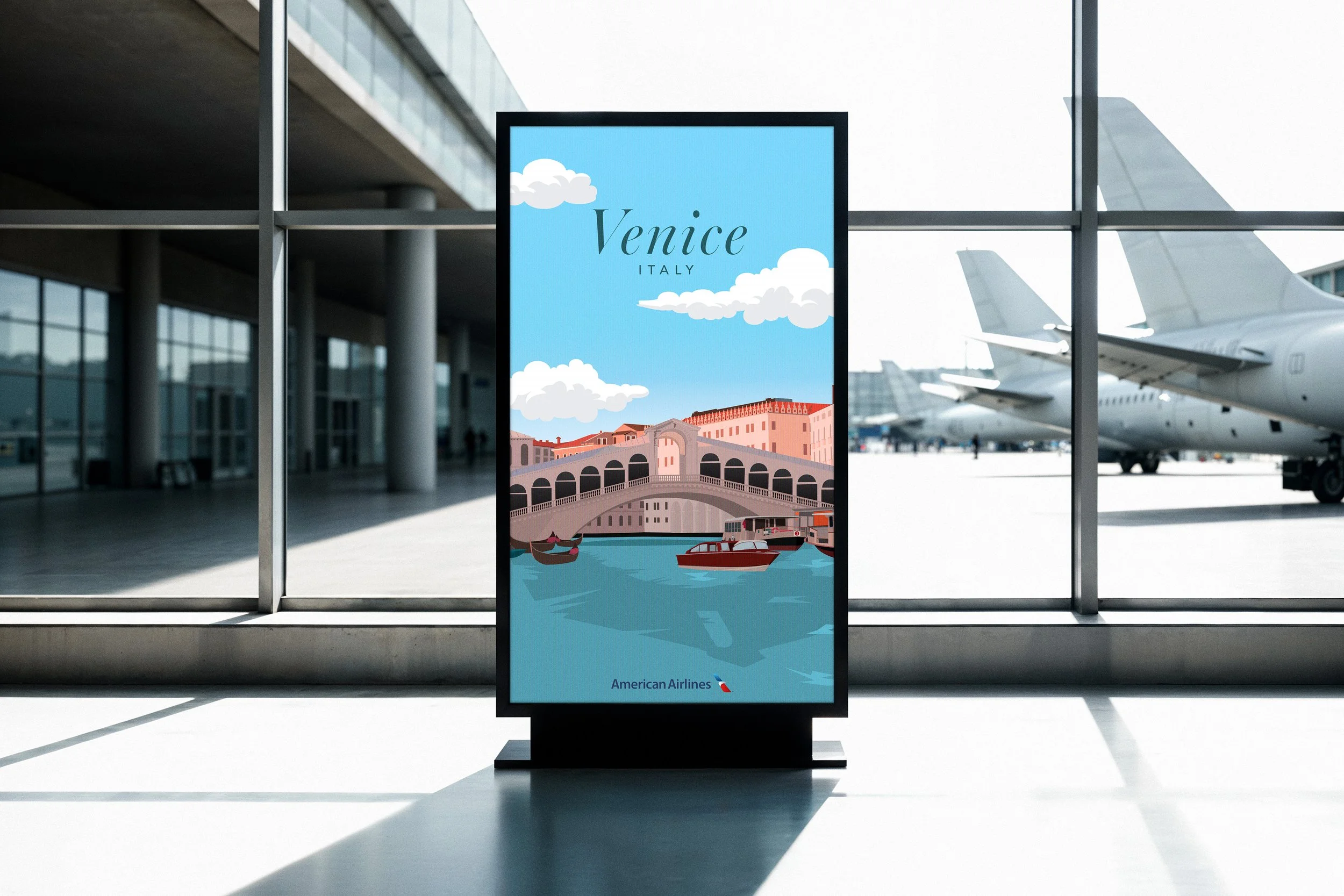
Airport Display Mockup
The poster was placed in an airport advertisement setting to show how the design functions in its intended environment. This helped test visibility, hierarchy, and overall impact from a distance where quick communication matters most.
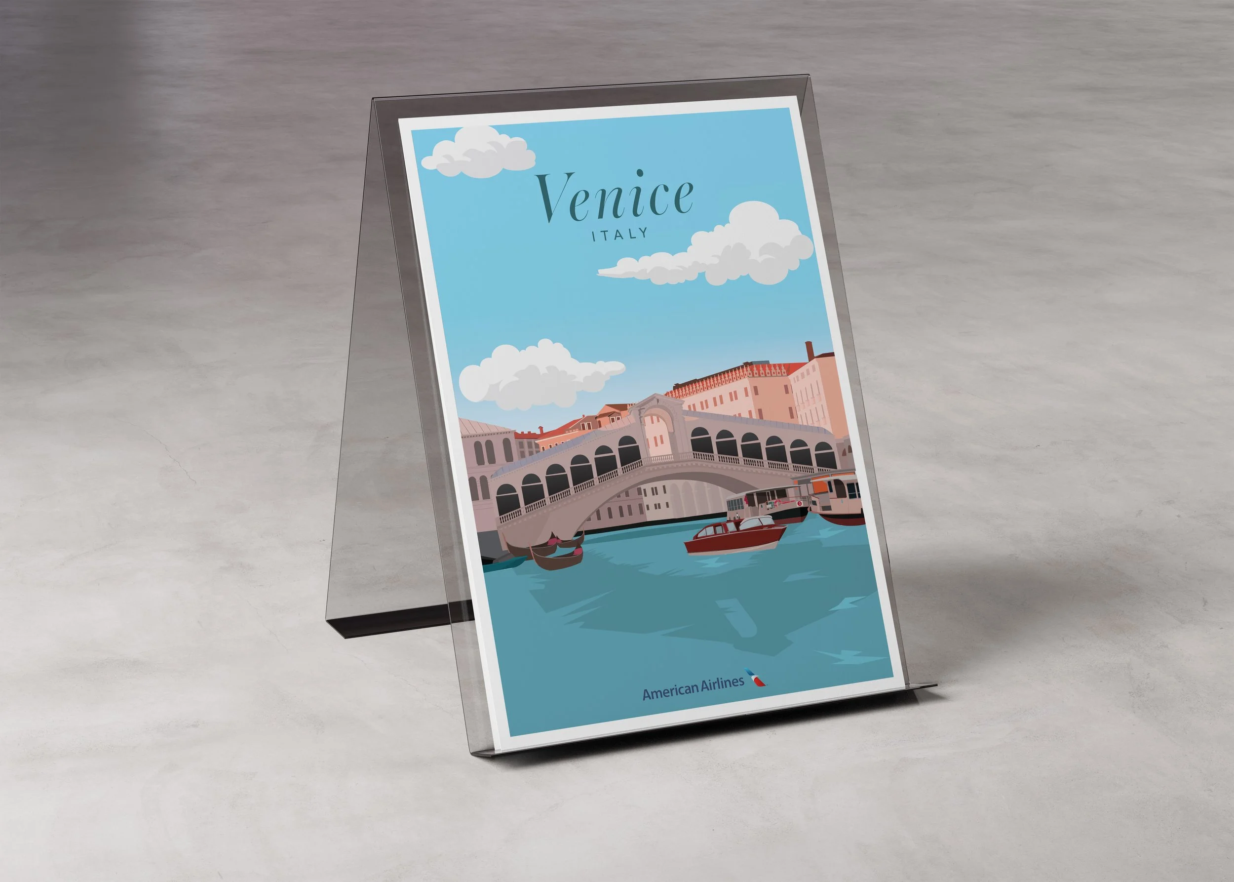

Print Presentation
This mockup presents the poster as a printed piece, allowing the illustration details, typography, and composition to be viewed more closely. It emphasizes the poster as both a branding piece and a visual design solution.
My Process
This project began by treating the professor as the client, where he explained the goals and expectations for the assignment. The objective was to create a destination travel poster for American Airlines that would feel visually strong enough for an airport advertisement while clearly representing a specific location.
The first step was listening to the project brief and writing a creative brief based on the client’s needs. This helped define the purpose of the poster, the target audience, and the overall goal of creating a travel advertisement that felt polished, clear, and destination-focused.
Creative BriefThe following week, I brought in four different destination sketches to explore possible directions for the project. Each concept focused on a different location and landmark, allowing me to test composition, visual interest, and how recognizable each destination would be.
Destination ExplorationDuring class critique, we reviewed all destination options and discussed which concept had the strongest visual potential. Venice was selected because of its iconic architecture, recognizable bridge, and strong opportunity for clean, illustrative storytelling.
Class Critique & SelectionAfter choosing the final destination, I moved into Illustrator to begin building the poster digitally. I focused on simplifying shapes, creating strong composition, and balancing the illustration with typography so the design felt both elegant and easy to read.
Digital Development
Over the next few weeks, the project continued through class check-ins and revisions. Small adjustments were made to color, layout, detail, and hierarchy until the final poster felt polished and ready for presentation as a finished travel campaign piece.
Refinement & Finalization