
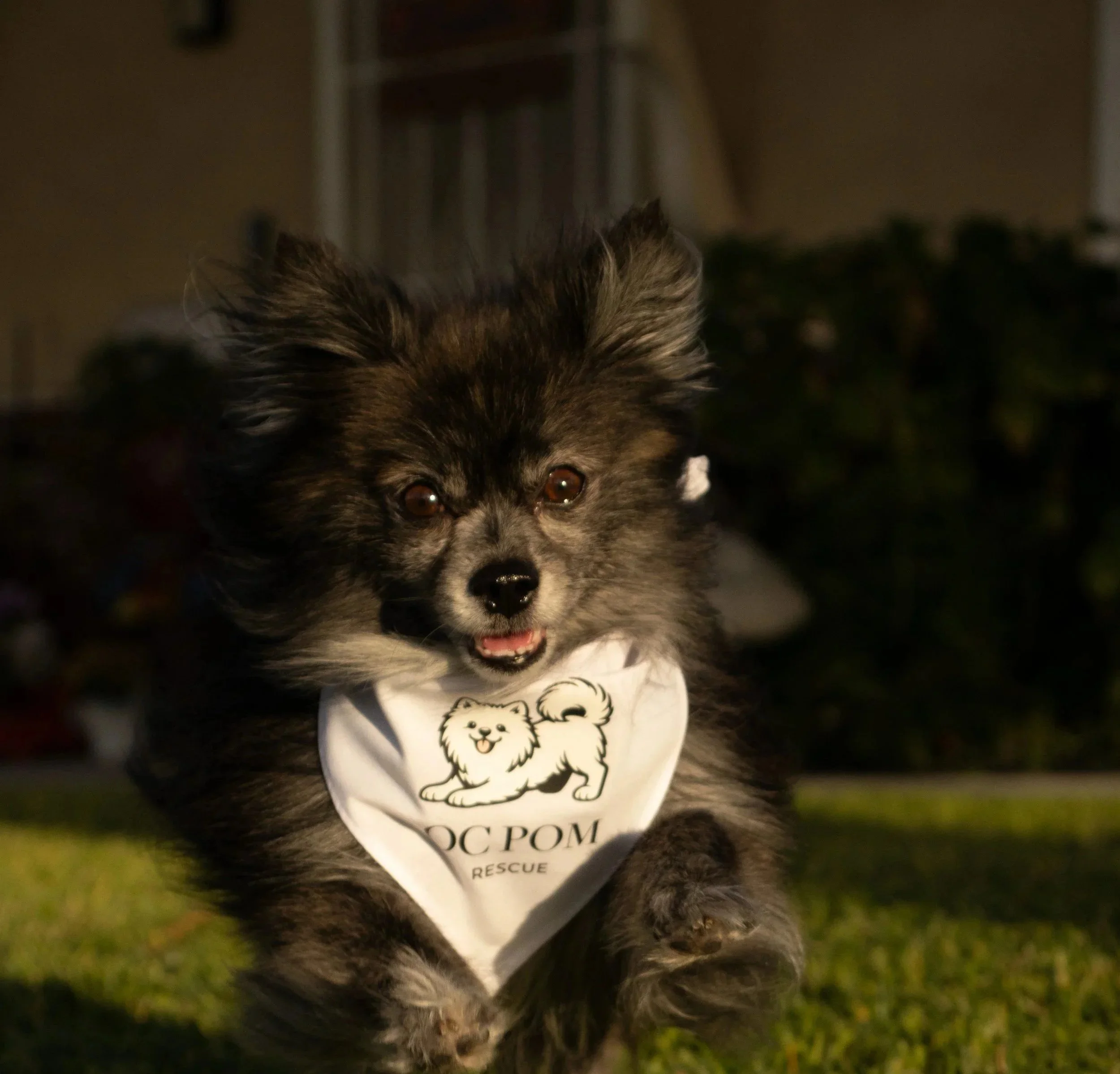
January 2026OC Pom Rescue Branding
Brief
OC Pom Rescue needed a visual identity that felt trustworthy, welcoming, and easy to connect with across both digital and print experiences.
The goal of this project was to create a modern rescue brand system that helped tell each dog’s story while making adoption feel more approachable, emotional, and community-focused.
Sketches
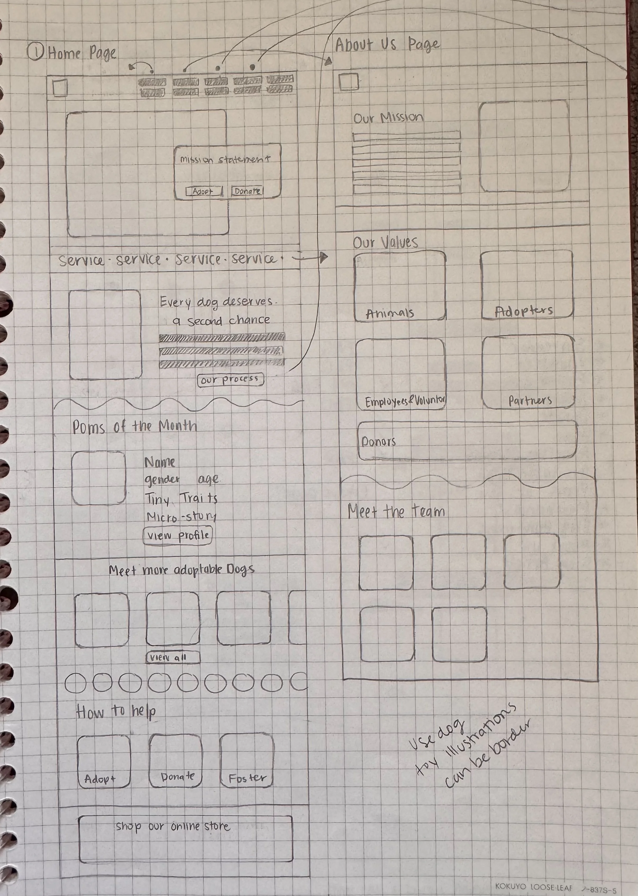
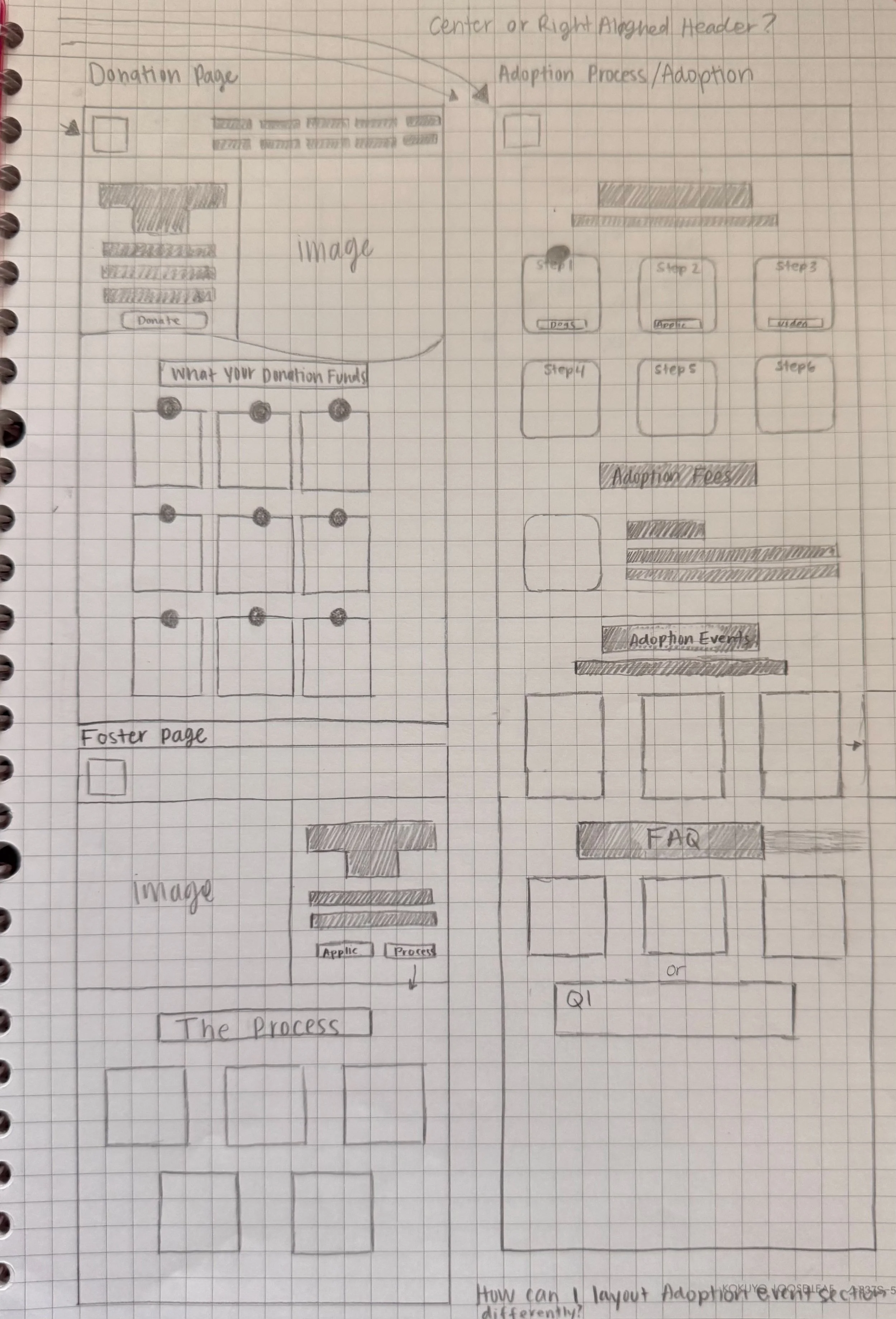
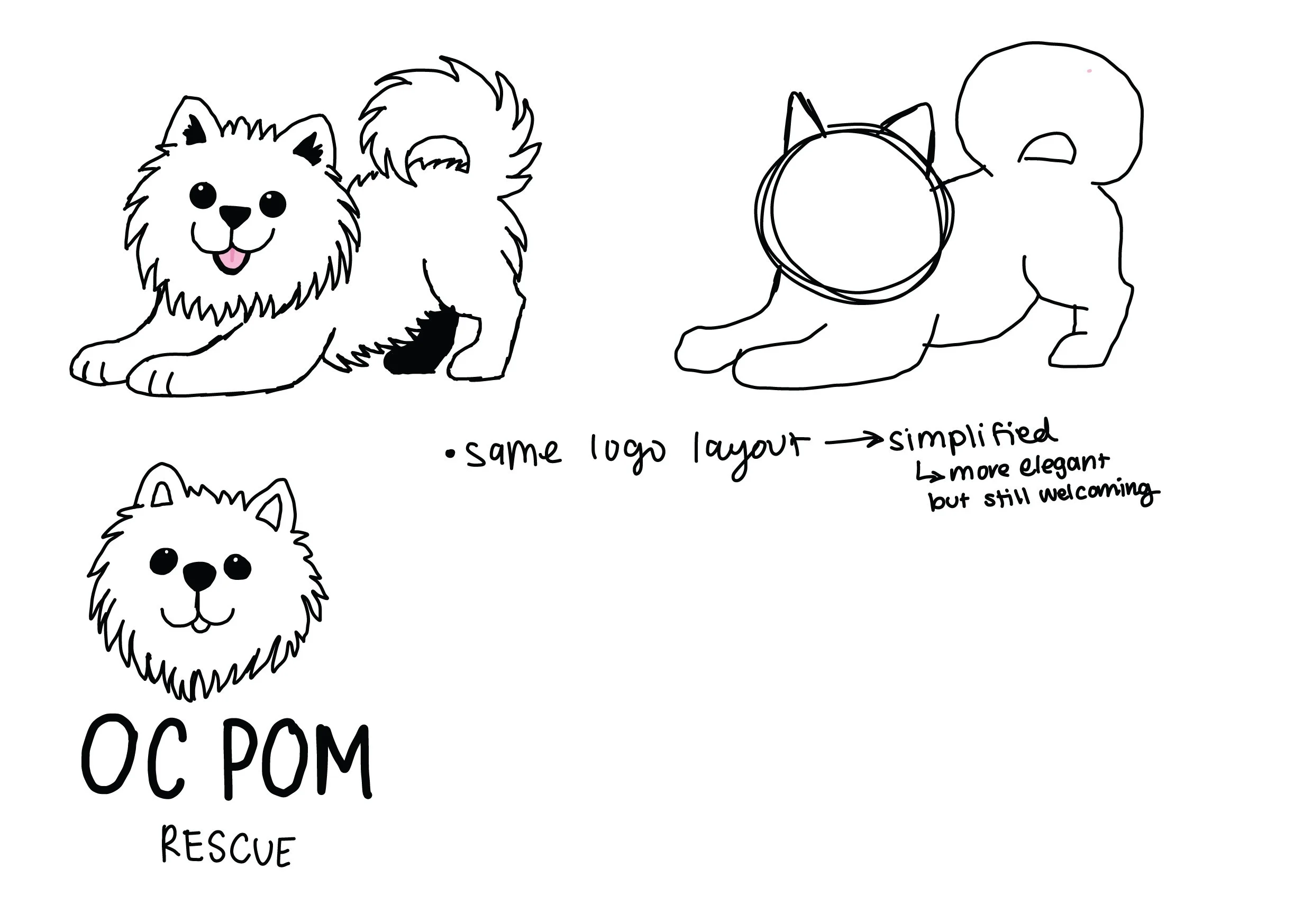
The process began with logo sketches, layout studies, and visual explorations focused on balancing a playful personality with a clean, organized structure.
Early concepts explored typography, badge styles, stripes, icon systems, and storytelling elements that could work across social media, print materials, and the website experience.
Visual Identity
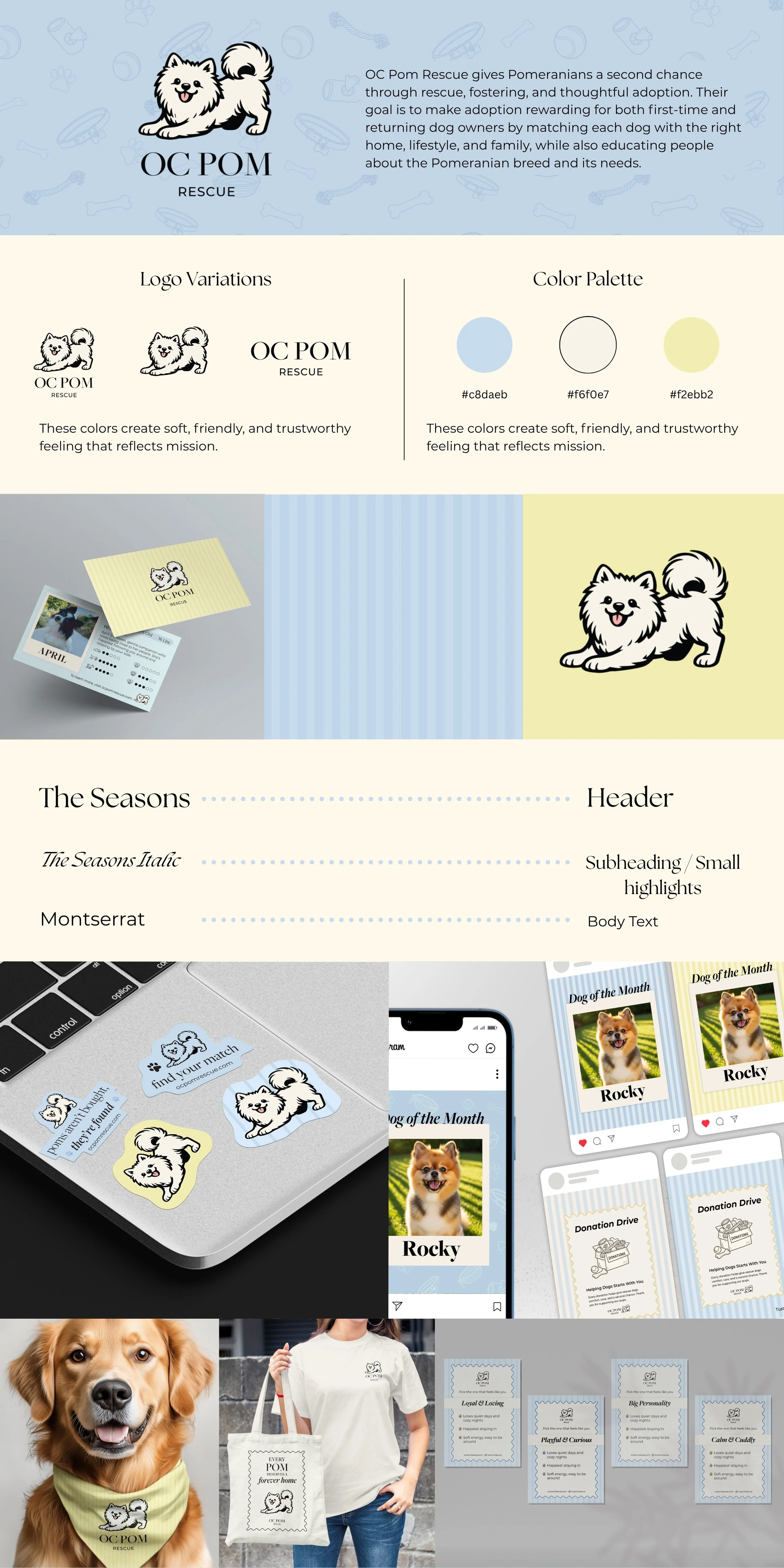
The final identity combines coastal-inspired colors, structured typography, and playful graphic elements to create a brand that feels warm, modern, and approachable.
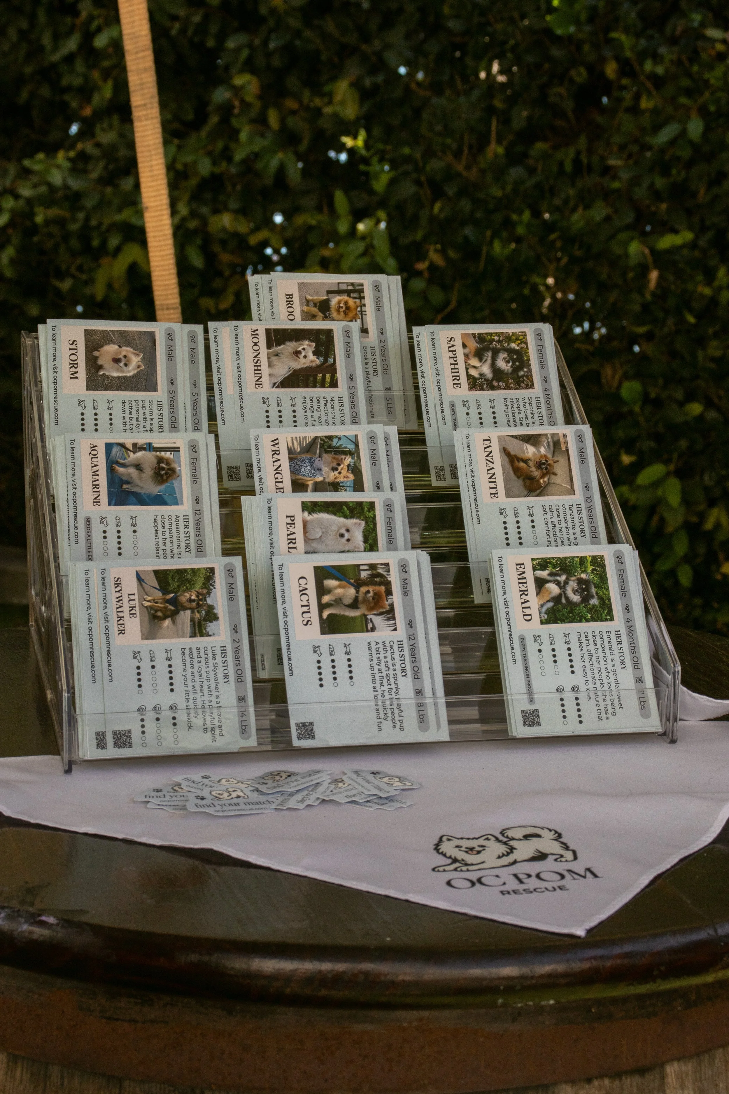
A flexible visual system was developed across social templates, adoption materials, story cards, event collateral, and web layouts to create consistency across every touchpoint.

Brand Application
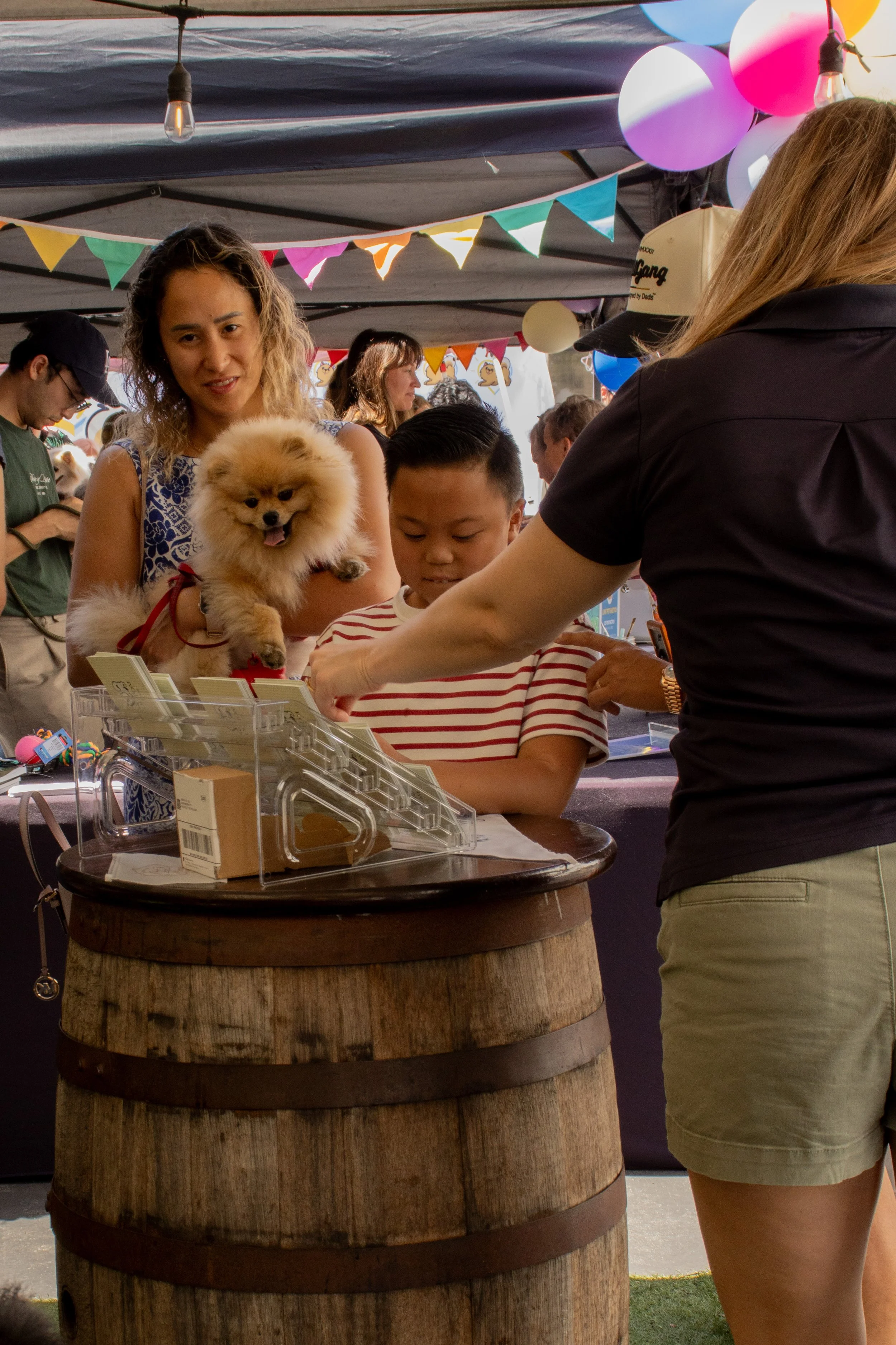
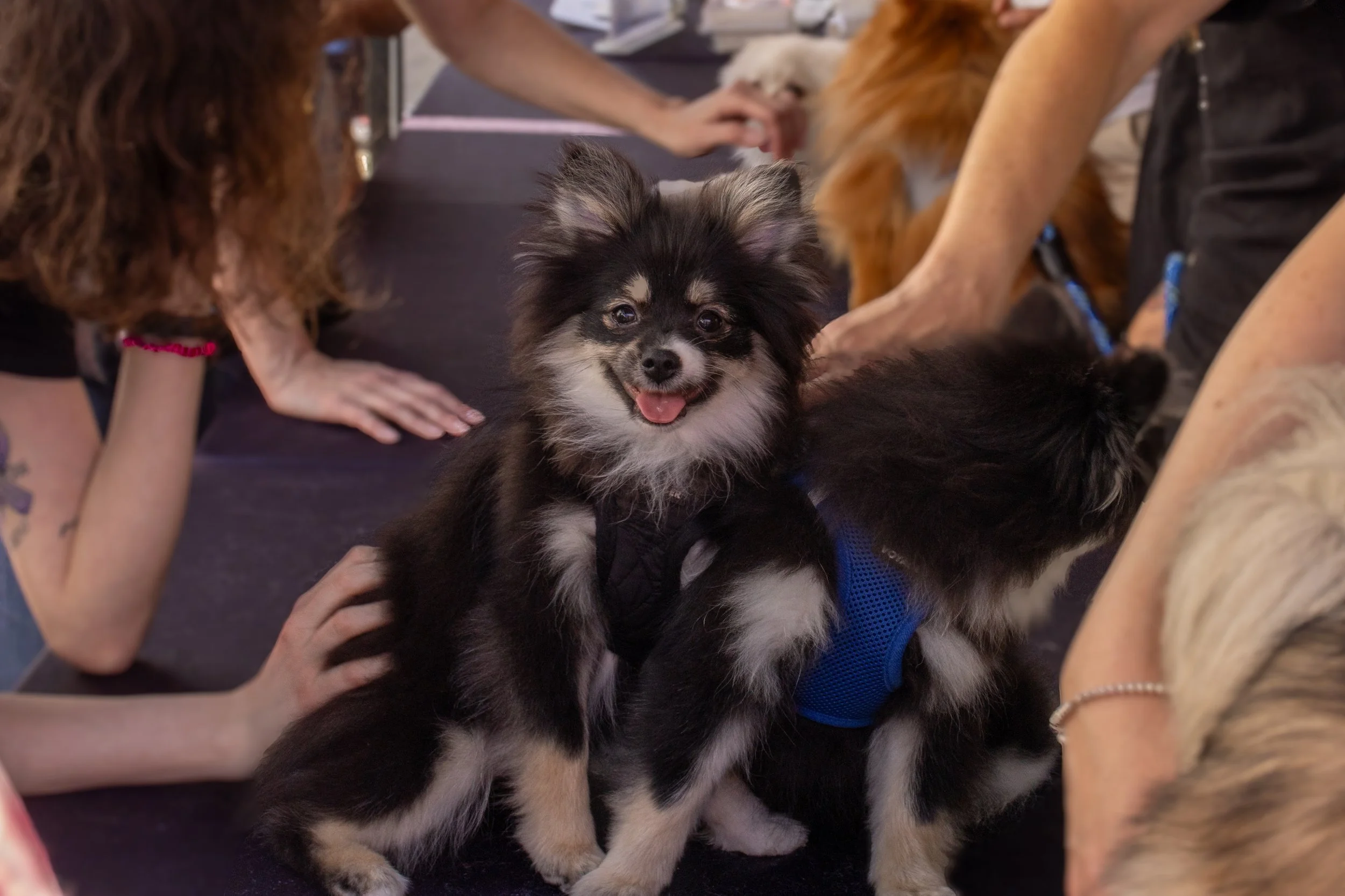
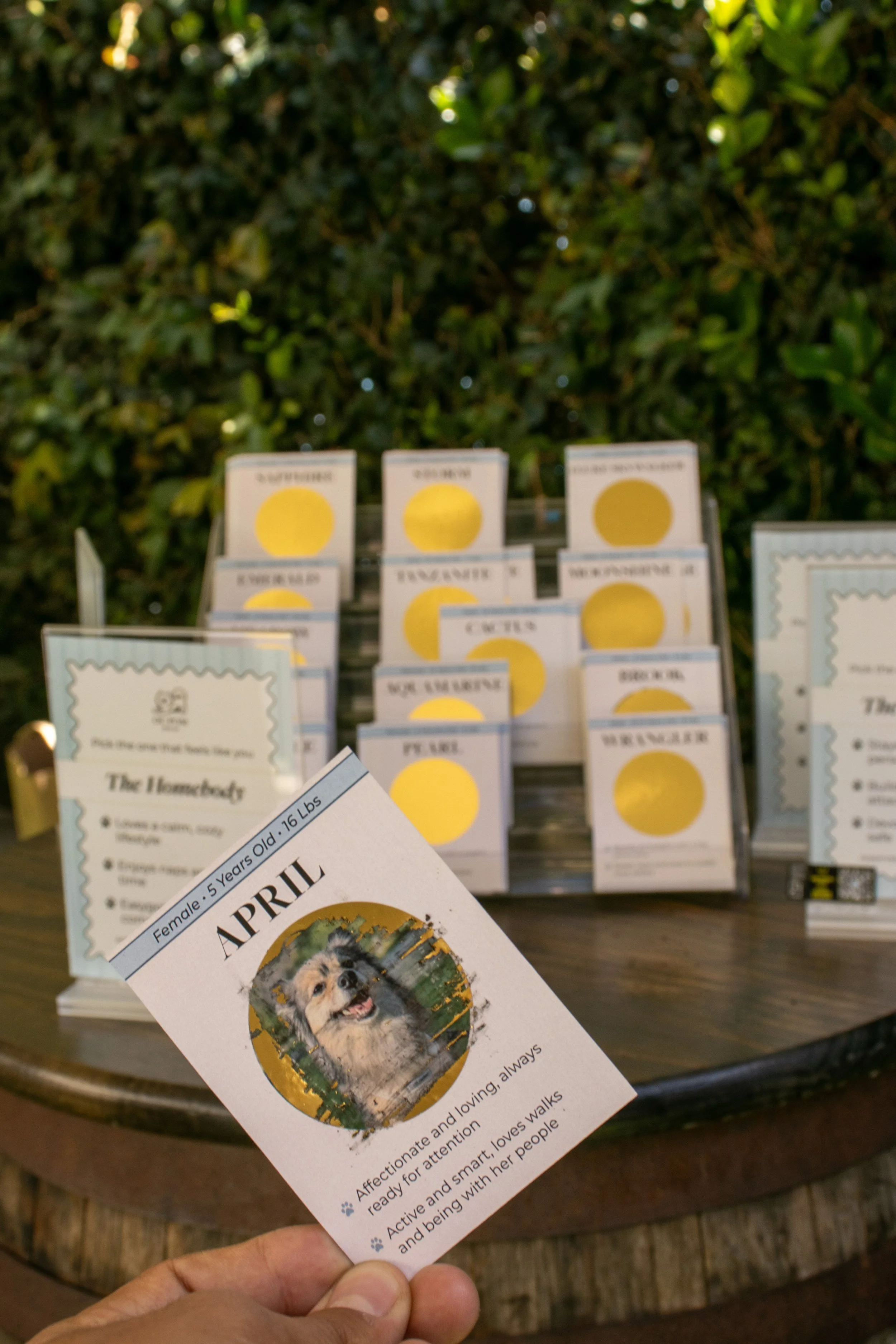
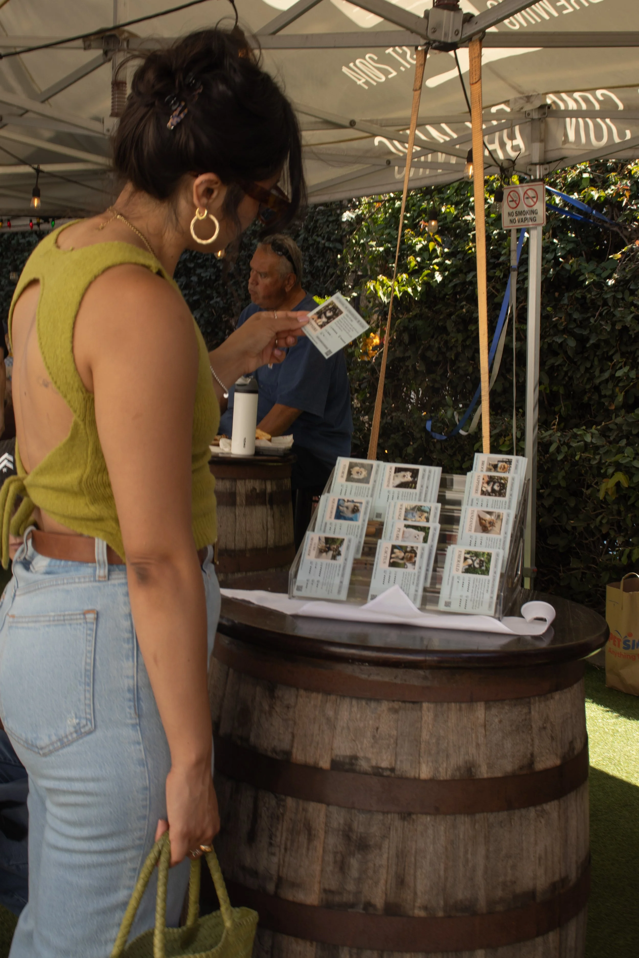
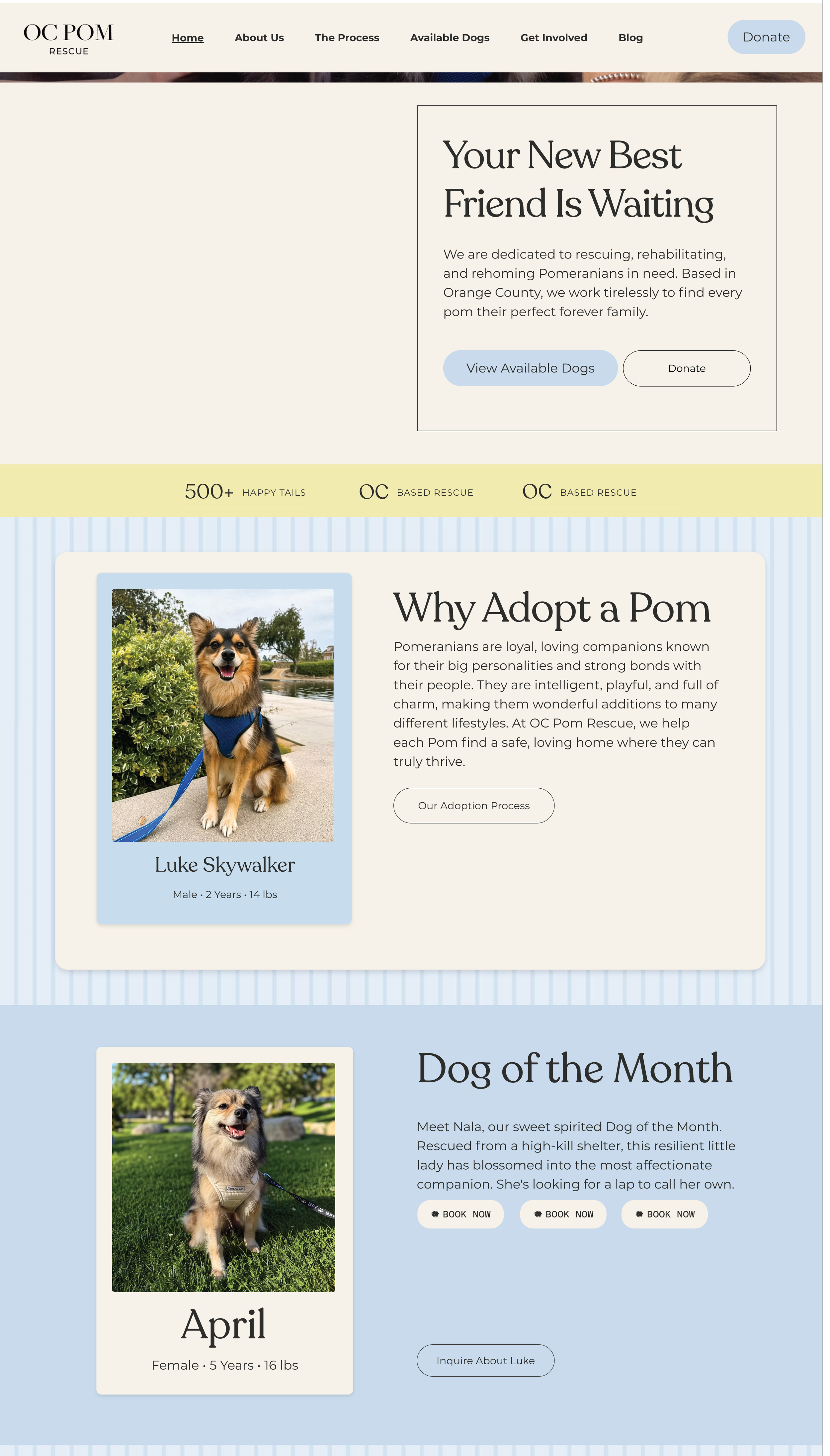
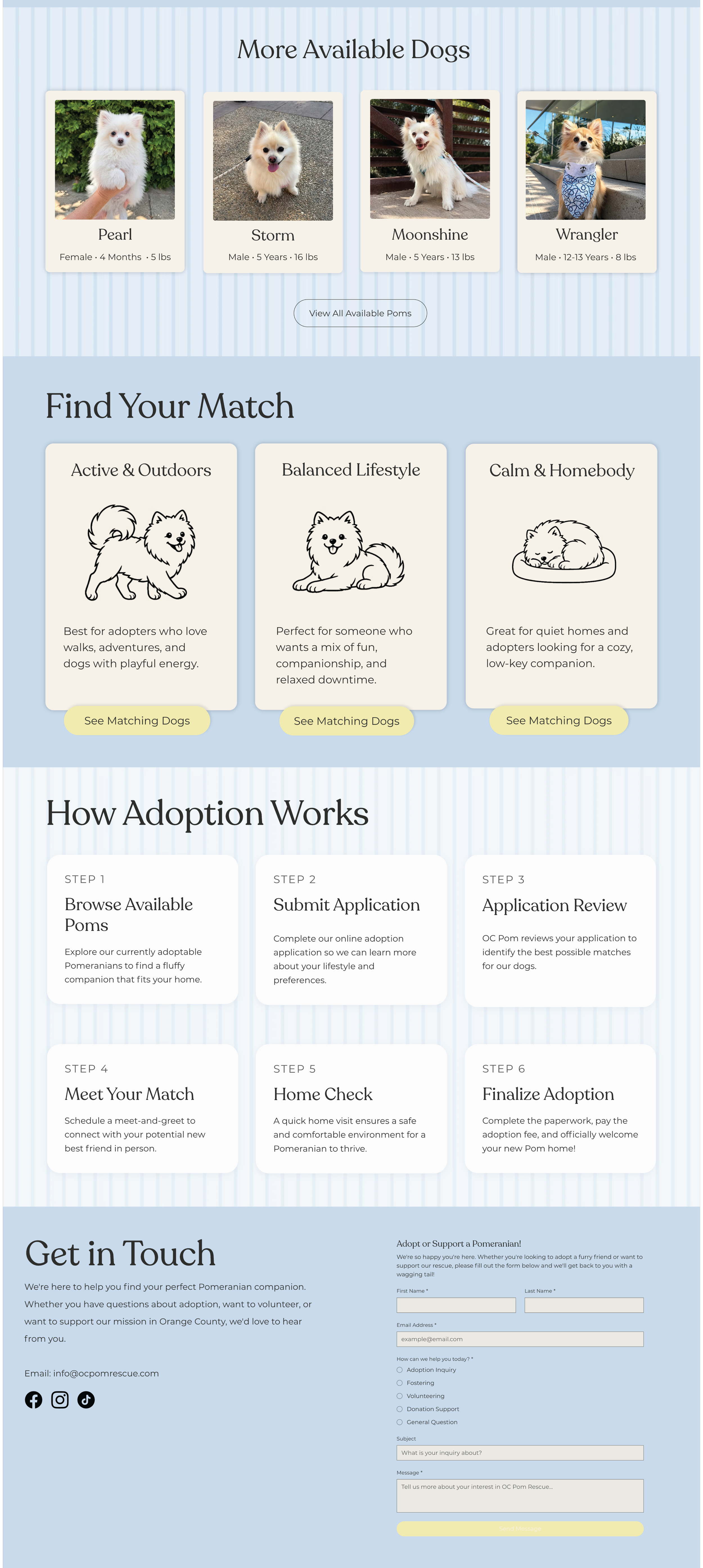
The identity was applied across a full rescue experience including adoption story cards, educational brochures, social campaigns, event materials, branded merchandise, and a responsive website concept.
Each piece was designed to strengthen emotional connection, improve clarity, and help potential adopters engage with the rescue in a more meaningful way.